At Benchmark, my role was nothing if not multifaceted. I led marketing initiatives, designed brand apparel, managed a full CRM transition, and even mopped floors on New Year’s Eve as a monsoon was flooding the gym. On a small team in a fast-growing business, I learned that no job is too small when you’re building something great. What mattered was having vision, perseverance, and strategic dexterity.
Here are some highlights from my work here!
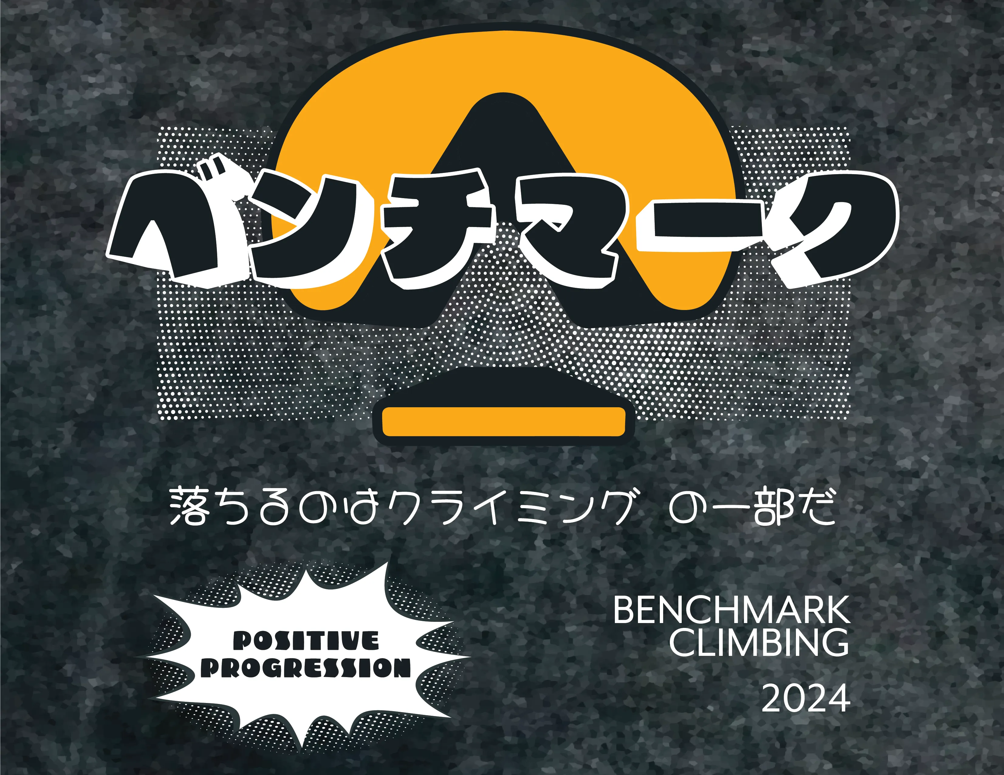
Merchandise
The merchandise I designed for Benchmark ranged from simple logo merch to high concept vibrant graphics. I took bold creative leaps, all the while keeping in mind that my designs must channel the spirit of Benchmark and not just appeal to the senses but send a message and embody what Benchmark represents.
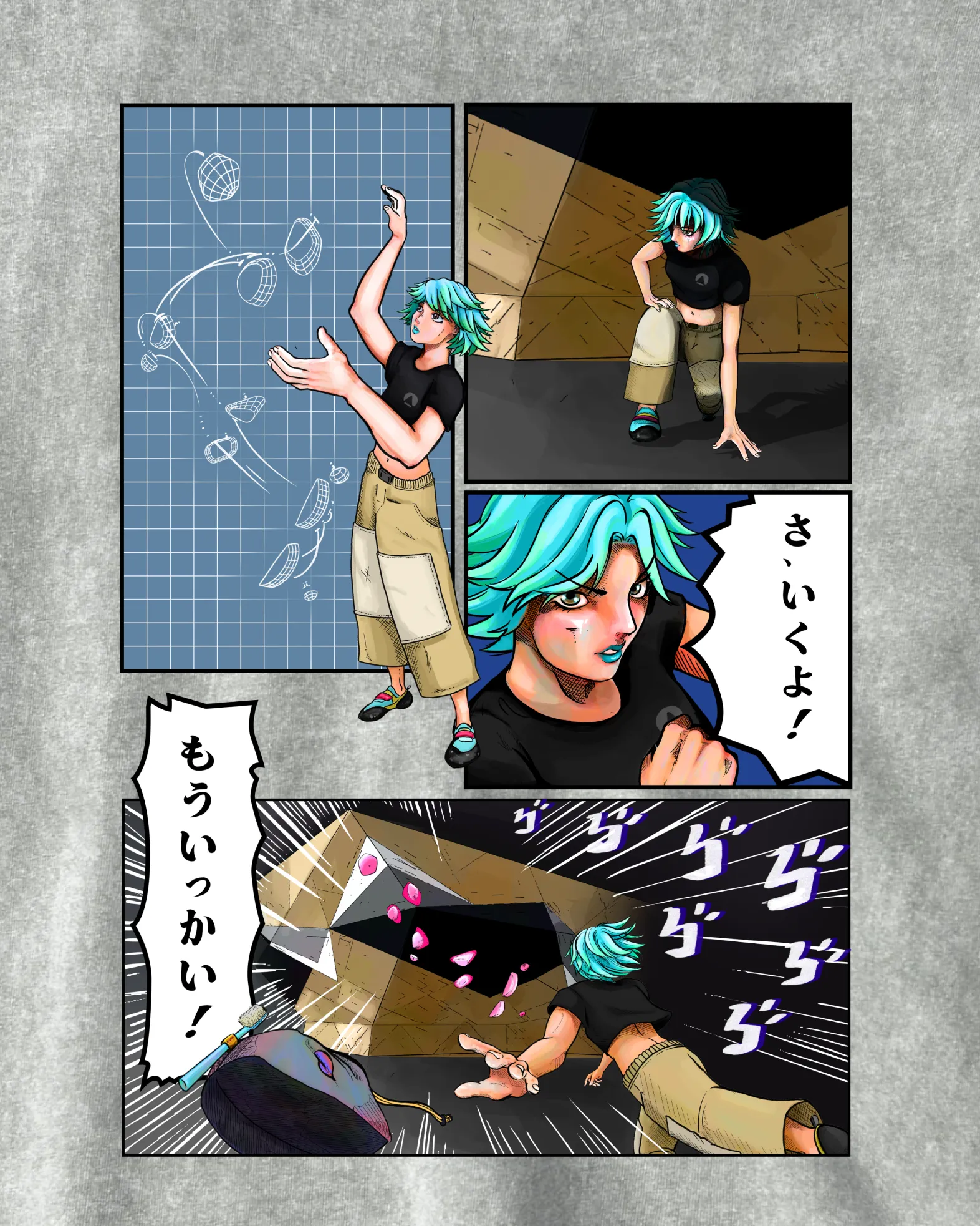
Anime Collection
These shirts tell the story of a climber, subverting expectations by depicting failure. However, what makes it more powerful is the message of fighting with tenacity and embracing the process, recognizing failures as temporary. Each time you fall it’s an opportunity to learn something more, find a new piece of the puzzle, and continuously improve. It’s the pure encapsulation of Benchmark’s motto, “Positive Progression”.


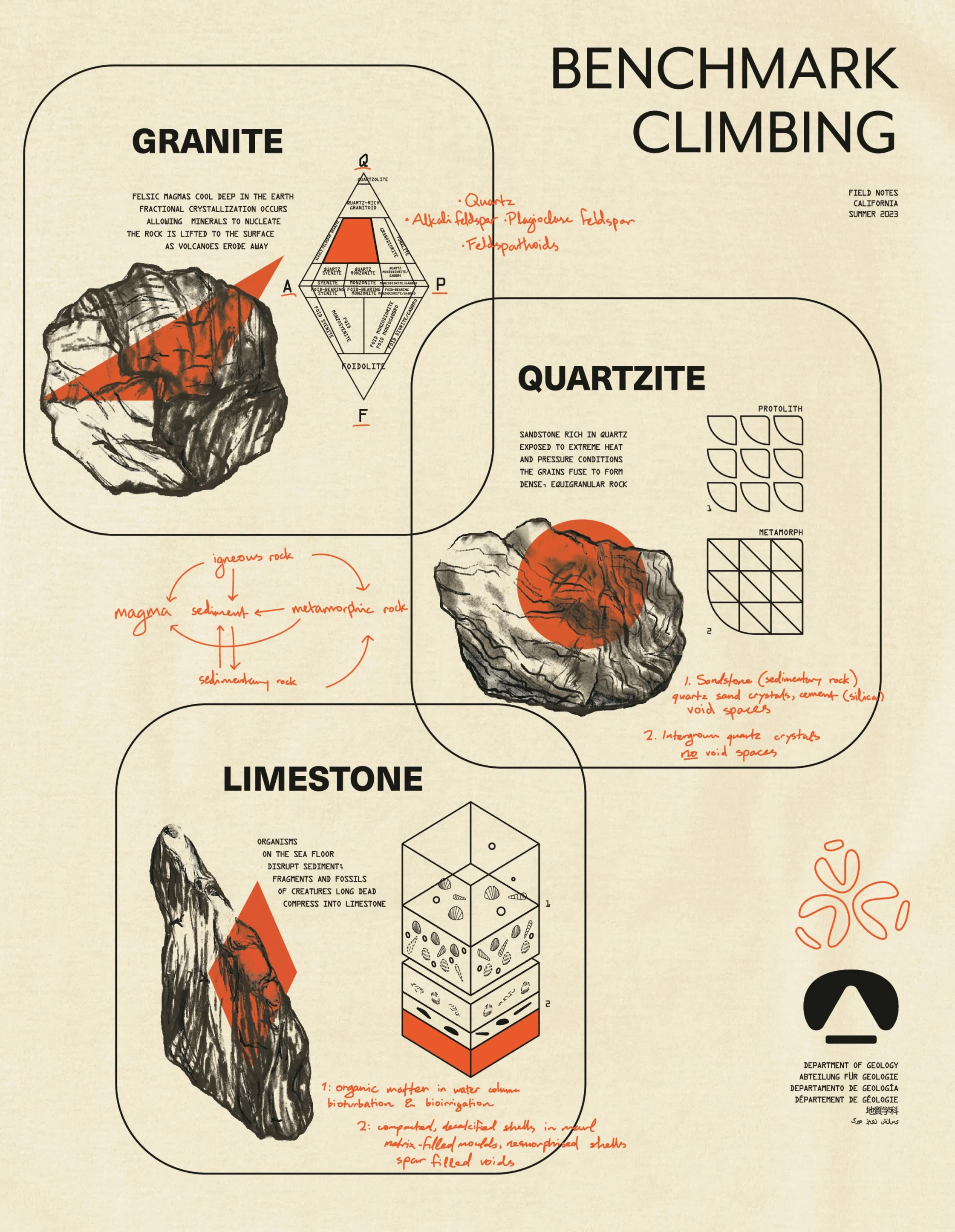
Field Notes and Historical Archives
This collection taps into the nerdy side of the climbing community. It was released during the summer Benchmark’s Berkeley location opened, so to kind of drive that connection with U.C. Berkeley with a bit of an academic aesthetic. The “Field Notes” design depicts hand drawings of classic boulders, putting the viewer in the shoes of a geologist out on a climbing trip and analyzing the rock formations. Each drawing is accompanied by a diagram and brief poetic caption that explains how the rock type comes to being. The aspect of Benchmark philosophy that this resonates with is the kind of persona that is curious, analytical, and creative.
The apparel isn’t yet the primary source of revenue for Benchmark, but investing in quality and creativity serves to establish a more significant brand presence; it’s one of the things that defines the voice of Benchmark. In the long term, maybe Benchmark ascends and becomes more of an expanded brand encompassing gyms but also consumer goods. One of the ways in which this has been impactful is also by stimulating the creative side of the climbing community, by releasing more than just the standard corporate merch we have opened the door to collaborations with other brands and designers within the community, like Hitorii.
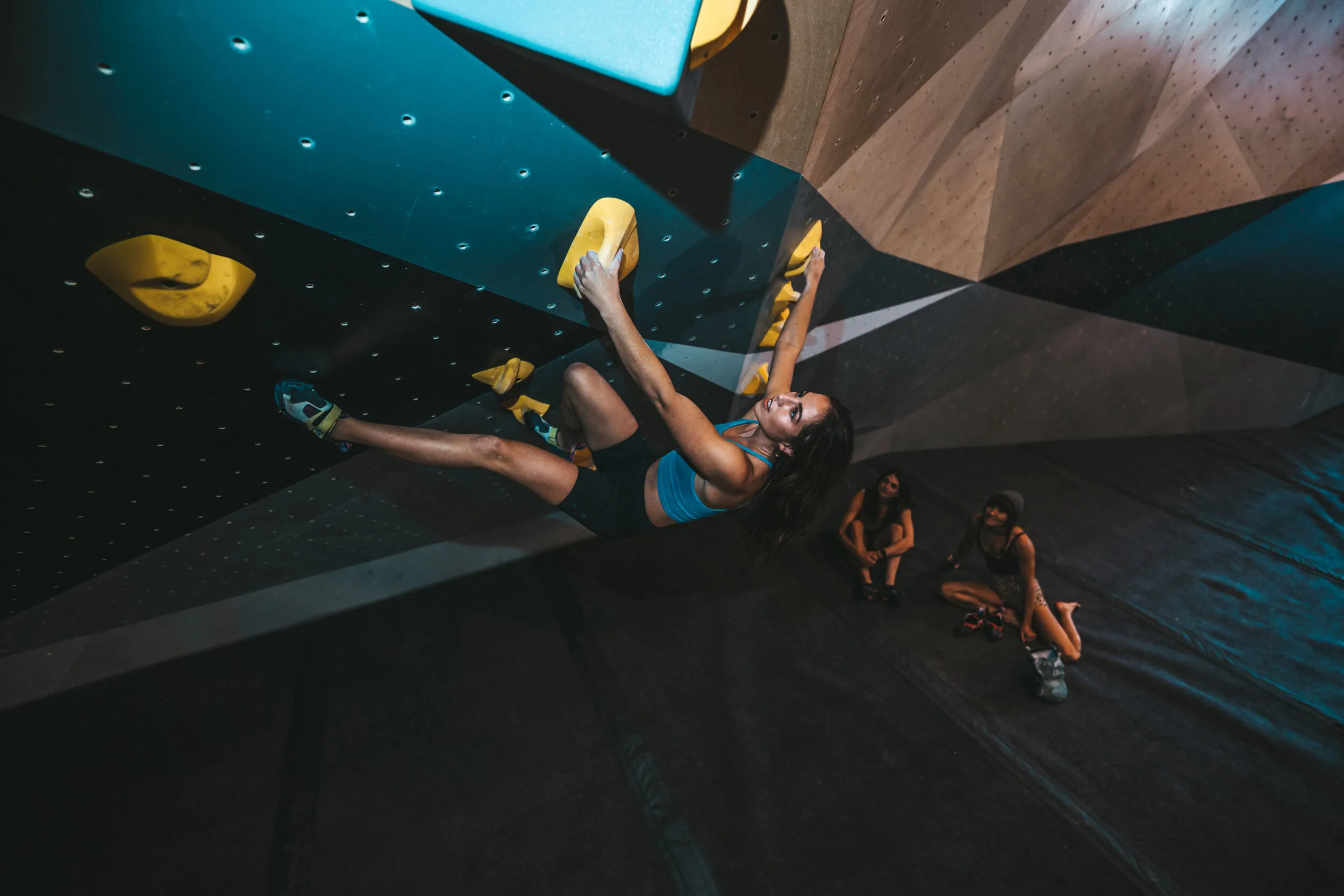
The extra cash is nice, but really what’s more impactful than selling 100% of the units is the people I witness every day wearing my shirts in the gym as someone who frequents the space. During a climbing session, you’re always walking around the space, having brief encounters with those present. Similar to skate culture, what people wear to climb is often highly self-expressive. Anyway, with all of that exposure, if even just one person on any given day is wearing one of the shirts, the number of eyes that hits is substantial. Arguably, less is more when it comes to production per design; people want to feel like they own an exclusive piece and seeing more than one person in the gym wearing the same shirt is kind of a lukewarm feeling.
Web Design & Content
I designed Benchmark’s website from the ground up and wrote all of its core content, shaping both the brand’s visual presence and narrative voice. My strategic approach focused on addressing the needs of three distinct visitor profiles — each with different goals, decision stages, and psychological touchpoints.
First-Timers Welcome
Climbing gyms are the type of fitness facility where each location is one-of-a-kind, and that customer decision can really only be made after physically engaging. So for casual browsers, the site does not necessarily need to sell a membership, but encourage trial visits through a day pass or punch pack. As such, it still must create an allure that makes the idea of visiting Benchmark irresistible.
Converting Leads
Visitors seriously considering a membership have likely been to the gym already, so for this audience the task is indeed to influence a conversion. Both the functional and the emotional aspects need equal attention.
-
Streamlined user flow for membership signup, reducing drop-off to near-zero
-
Clear communication of value drivers, such as standout features like system walls
-
Strategic content placement so visitors encounter persuasive info naturally
-
Visual storytelling that shows what it feels like to be part of the community
Business & Stakeholder Trust
For potential partners, collaborators, and investors, the website needed to convey professionalism, leadership, and long-term potential. To this end, I crafted the About page to reflect the team’s philosophy and vision — a contribution that sparked interest from a real estate partner who later cited the page as a key reason for initiating a multimillion-dollar property deal for Benchmark’s second location.