“fiori” means flowers and “fuori” means outside. Fiori Fuori is a joyful hub to learn about the biology, symbolism, and cultural significance of all the flowers you’d find out and about. I came up with this after a tough flower shopping experience. The shopkeeper was helpful, but flowers are expensive and frankly I couldn’t tell if I was getting upsold; I wished that I could have had some kind of easy, organized companion resource.
Discovery
My background research included a competitive audit (Instacart, boutique online flower shops, etc.), reading blogs on common design challenges in the space, and interviewing people of varying backgrounds and levels of experience with flowers. Interestingly, both advanced flower enthusiasts and clueless chaps expressed interest in the value proposition. Based on what I gathered, I created two user personas, defining key pain points.

Julia
36, Amateur Florist
Julia wants to nurture her newfound passion for floristry, but struggles with work-life balance.
- “Floristry has been wonderful. I love that there's so much to learn and discover, but it's hard to find the time or energy.”

Clyde
26, Gift-Giver
Clyde has trouble finding the right flowers to gift his friends and family, and feels anxious talking to shopkeepers.
- “Why does it feel like there are so many flowers, yet so few that seem right for the moment? I'm overstimulated.”
Prototyping & Testing
I created a Figma prototype for my “flower shopping app” and tested it in a remote moderated usability study. I provided prompts for completion in app, took note of their behaviors and reactions, and asked follow-up questions. The insights I gathered from this study unearthed the true value of what this app could be, and I made it bloom in the following iterations.
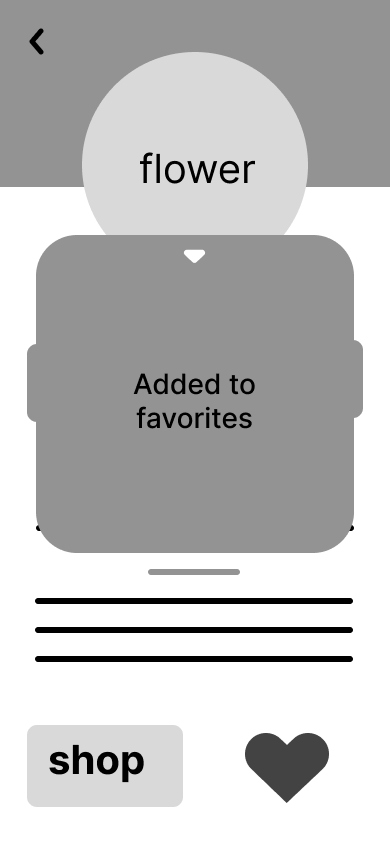
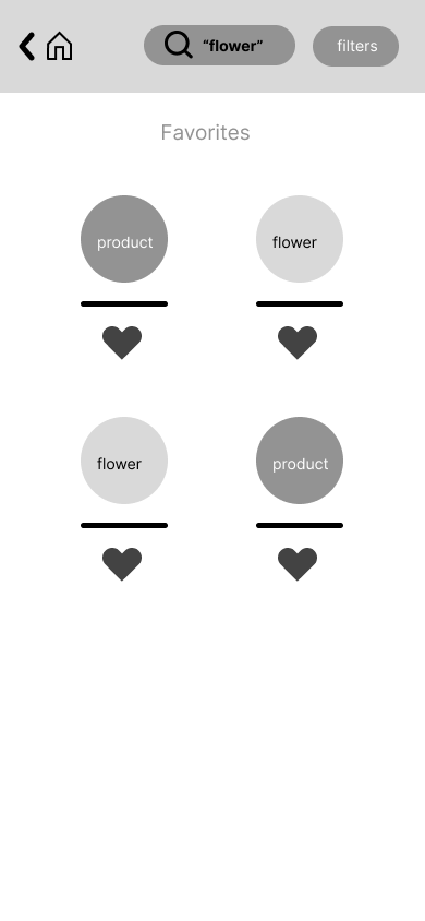
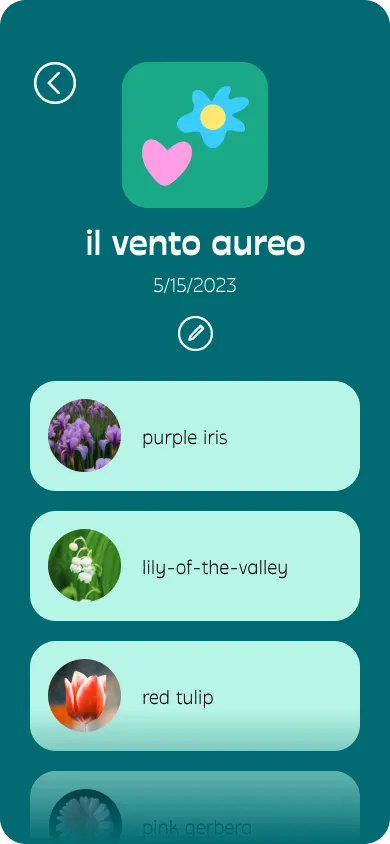
Wanting more from favorites
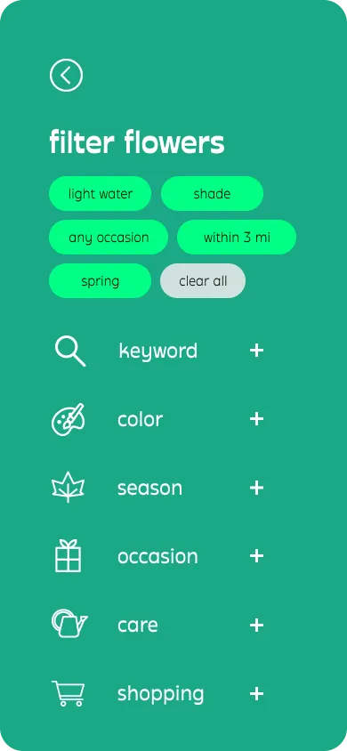
While browsing explore, users would heart several flowers; over time the popup got annoying. On the favorites page, most were unsatisfied with a multi-filter as their only way of sorting through flowers, even if it did cover all the criteria they needed.
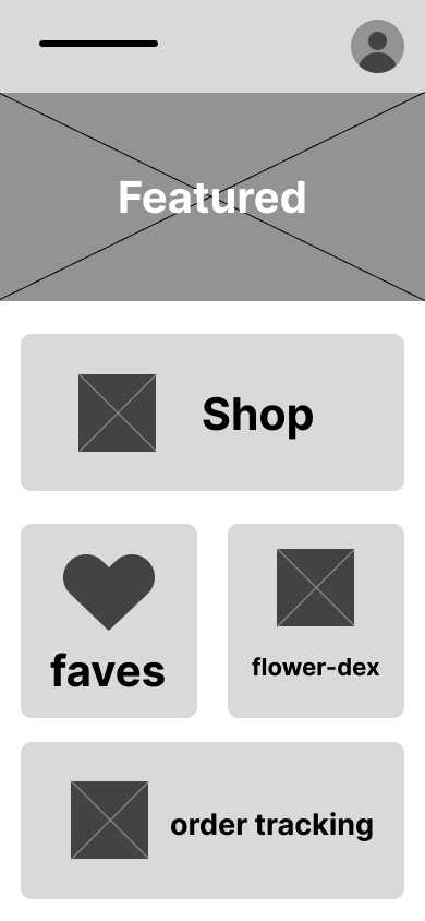
Just looking, thank you
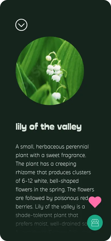
In shop, users would click on many products to save, but only one person actually completed a purchase. Most were not so inclined, even if there was a particular flower they strongly intend to buy (at some point).

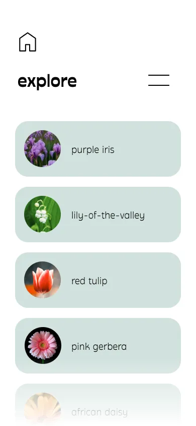
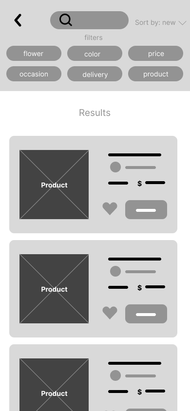
Which is which
The distinction between products and flowers as separate search lists was not clear enough to keep users from getting mixed up. Users also frequently wanted to refer back to their favorites list as they shopped; going back-and-forth made it all the more difficult to keep track.
Reflection
This project illustrates the importance of treating each iteration of a product like a hypothesis. When tough feedback came in, I had to be willing and able to make significant changes to my design. Great insights emerged from the scientific process, but of course it was still up to my intuition & creativity to come up with better solutions. Adaptability paid off; testing with the current version showed that users were significantly more satisfied by the end of their journey and twice as likely to purchase flowers.
Standing on Business
Sometimes a UX problem can be an indicator of how the business model needs to adapt. For example users’ uncertainty about flower delivery as an option might not be best fit to solve purely through UX, and thus not worth the investment if greater value can be created by modifying the business itself. However, just because UX might not be the solution doesn’t mean the design process is not worthwhile. The insights revealed can save a company from going down an expensive path with low returns; in this case sidestepping the complex and costly endeavor of integrating delivery services.
What’s Next?
A library of robust, bucketed information on every flower type imaginable. More popular and common flowers could receive higher-fidelity cards with detailed, dynamic, and manually curated content, with a more boilerplate card structure to fall back on for lesser-known varieties. Like how Spotify embellishes the music player interface with special features such as lyrics, videos, tour info, merch links, etc. for popular songs and artists.
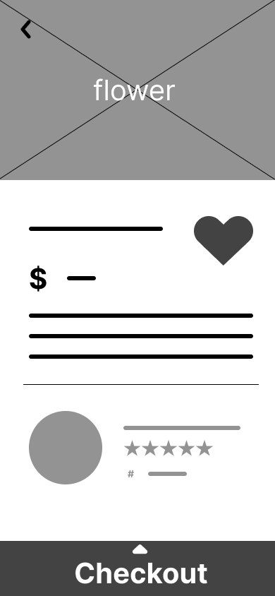
Shop— screens for viewing details of a flower shop & browsing their flower selections. Feature ideas: sort methods i.e. relevance, price.
A simplified “orders” screen that is redesigned for in-app orders being exclusively pickup. Feature ideas: satisfaction guarantee and/or time-sensitive order canceling.
App for business side, likely large screen based, for flower shops to list their store on the map, add flowers they have in stock, and other necessary operating tasks. The service would need to offer an enticing compensation model for partner shops due to likely incurring added costs.