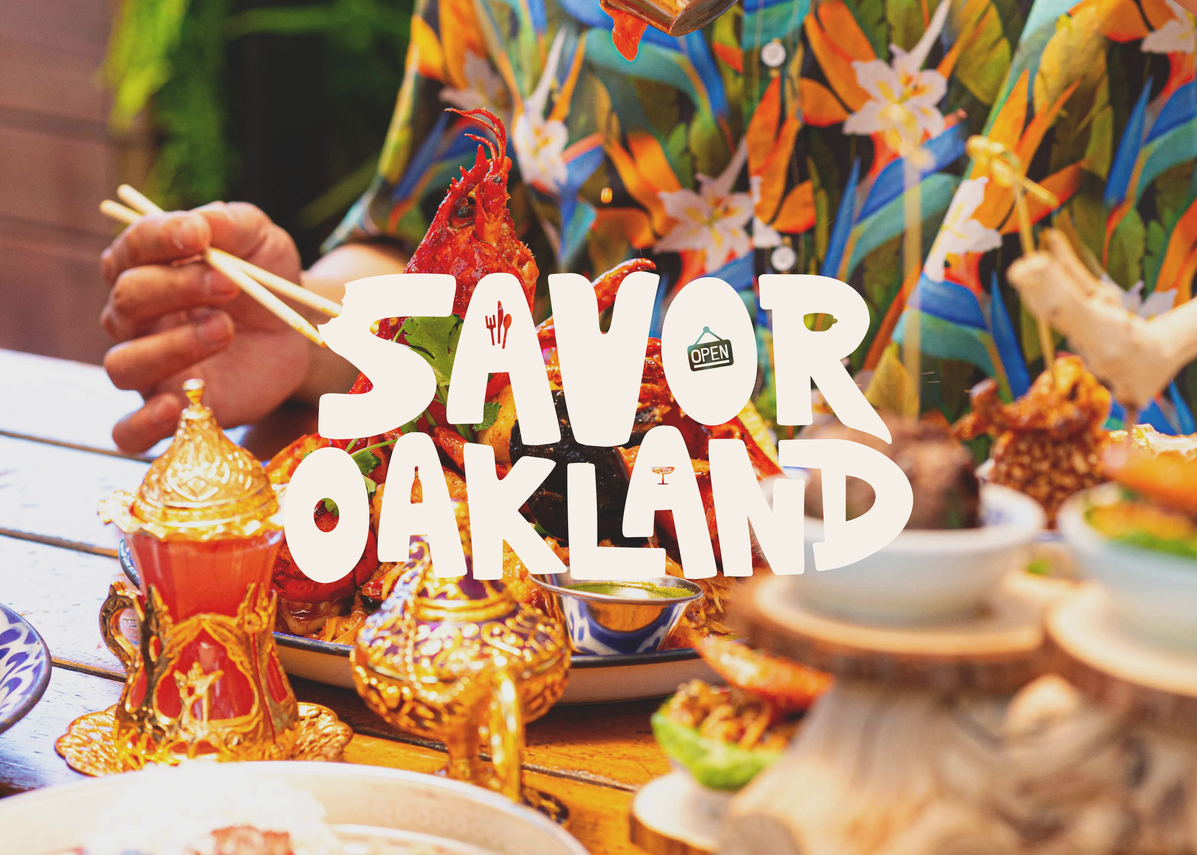
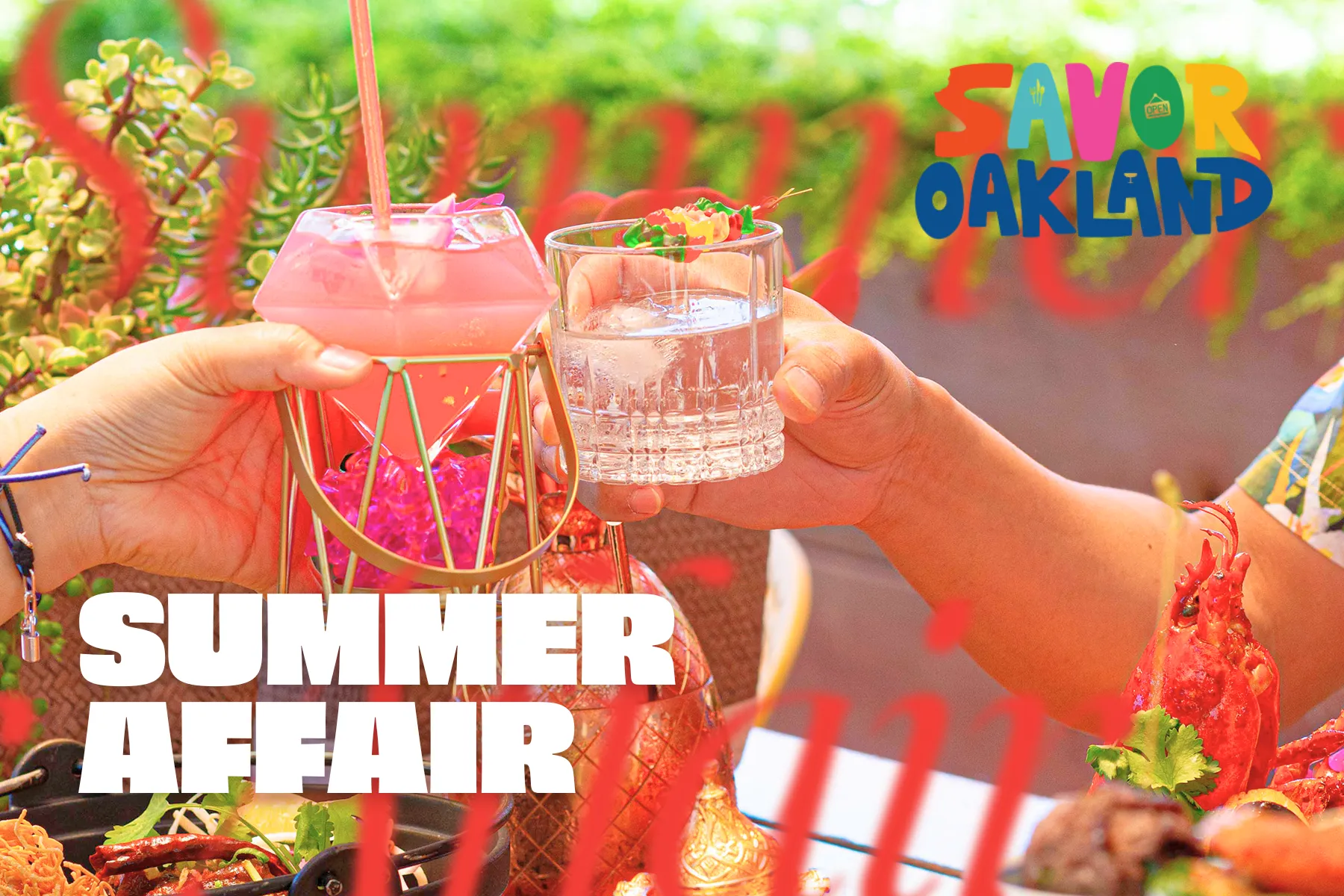
The Oakland Restaurant Collective (ORC) is a nonprofit community-oriented organization that serves to support and cultivate the hospitality industry in Oakland, California. I helped create a cohesive visual identity for their consumer brand, Savor Oakland. My key contributions included concept development, typography selection, and creative direction for the brand’s first major campaign, “Summer Affair”.
Typography
For the typography, I made sure to think about different facets of the organization: friendly, foodie, natural, urban, multicultural. I first chose an all-caps font that is bold and energetic, but with hints of softness here and there that convey elegance. For subheaders and copy, I went with a variable serif font, one that can be toggled with soft edges, optical size, weight, and a “wonky” setting, which modifies certain characters such as the lowercase n. Perfect for an brand that represents a professional organization while also alluding to the unique charm of Oakland.


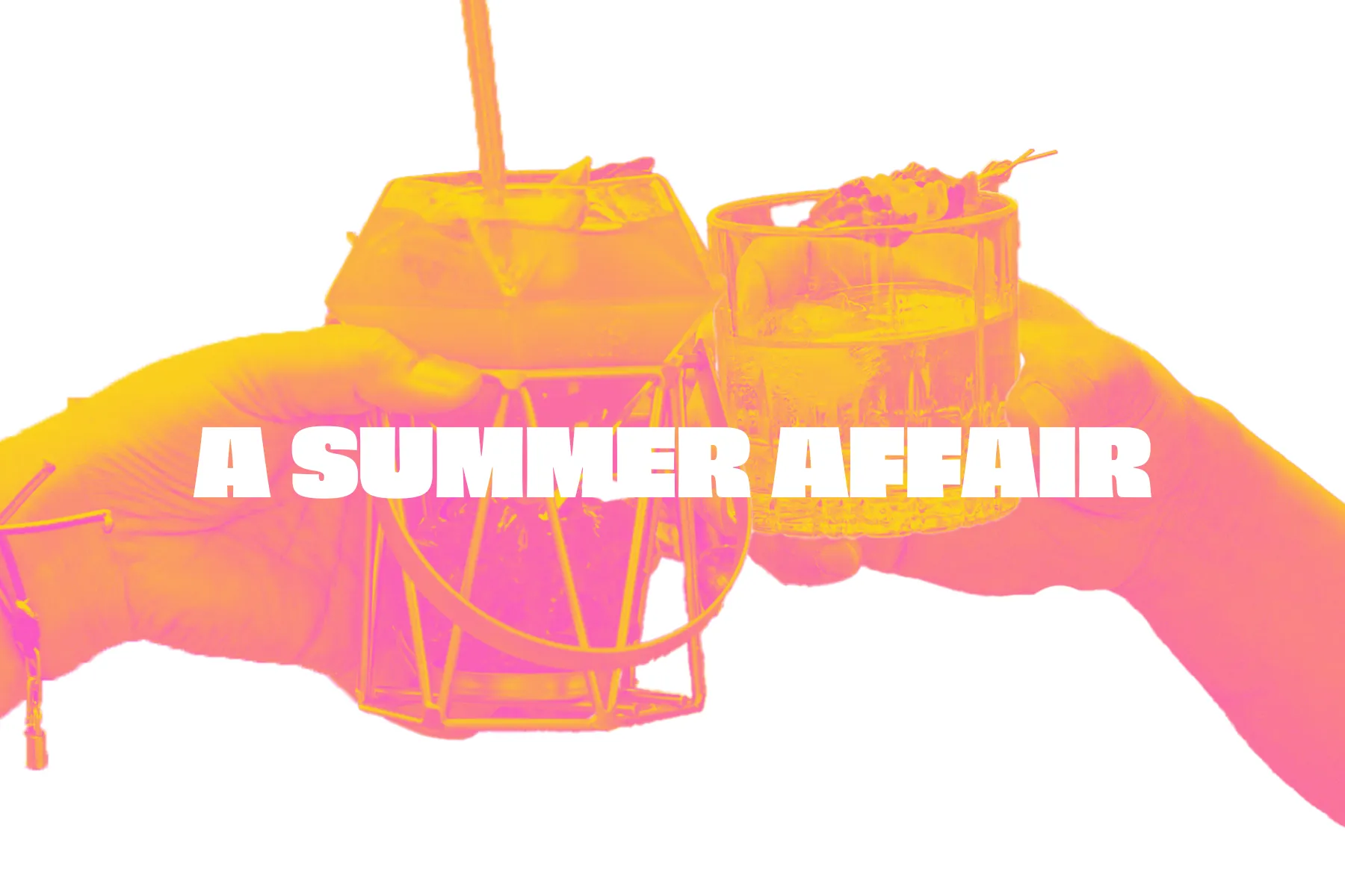
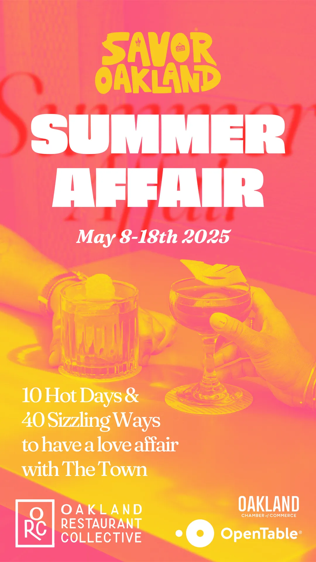
Summer Affair
Savor Oakland launched this year with a campaign they are calling Summer Affair. Here are selections of marketing assets I designed for use throughout all sorts of engaging activities and events such as bar crawls, food fairs, and menu collabs.
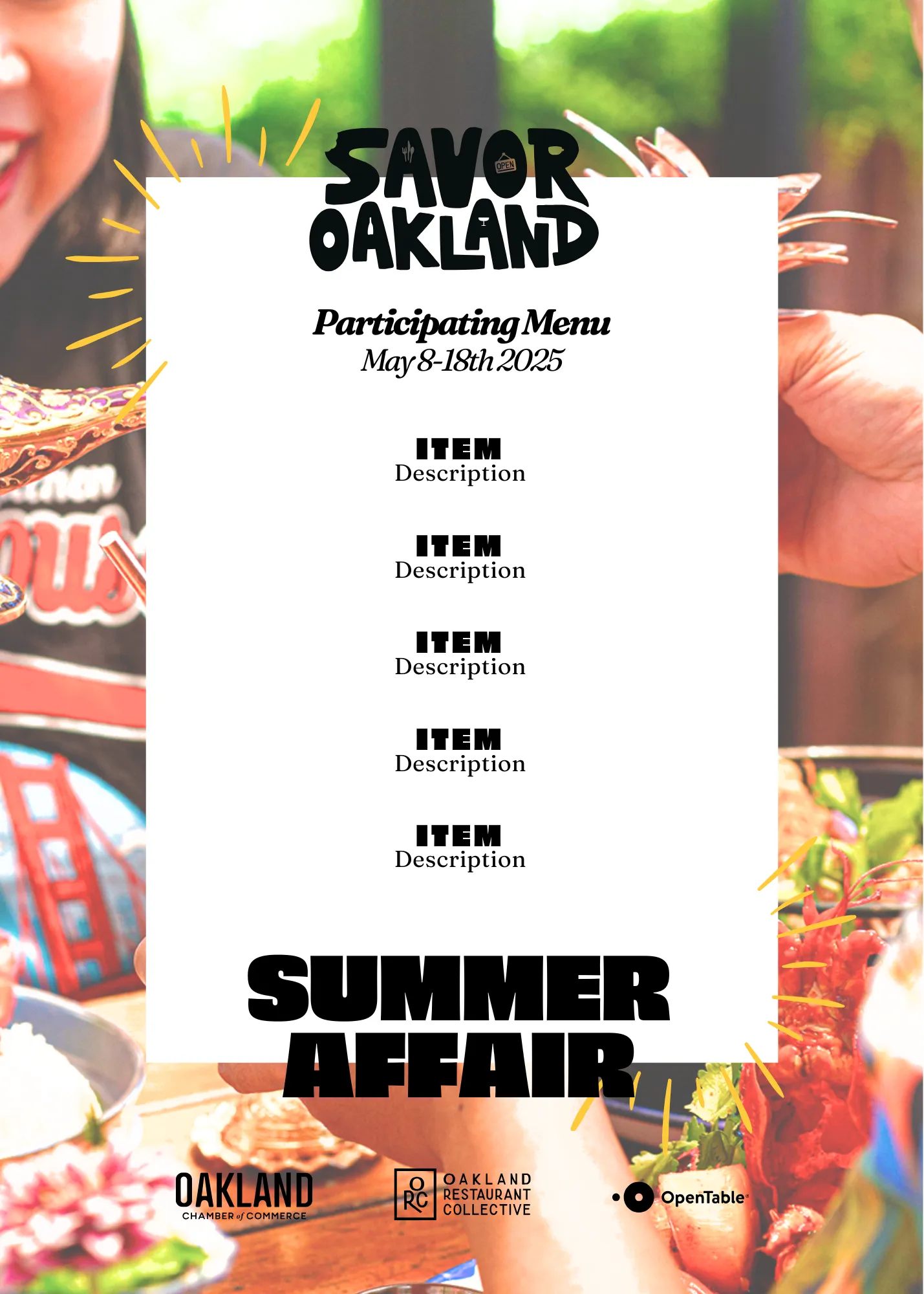

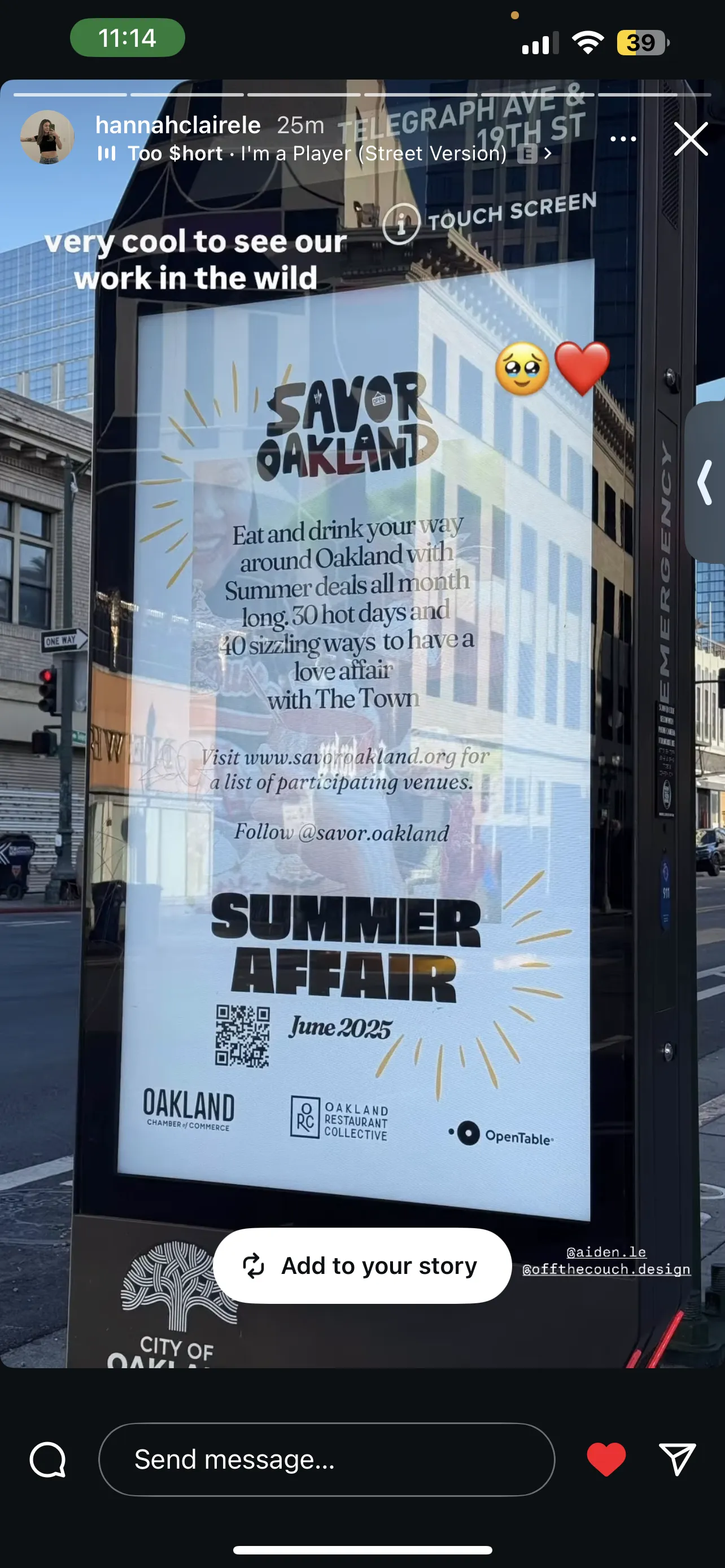
Use Case
Here is an example of an asset out in the wild. The asset is a verasatile one, suitable for both digital and physical spaces.
Queer Advisory Panel
The ORC continues to develop the community and build grassroots movements through the uplifting of minorities and promotion of safe spaces. Most recently, they started a Queer Advisory Panel in partnership with Resy and American Express, with the first event taking place at Friends & Family bar. This is the graphic which I designed to promote the event.
